
Branding, Packaging
TATA Consumer Goods
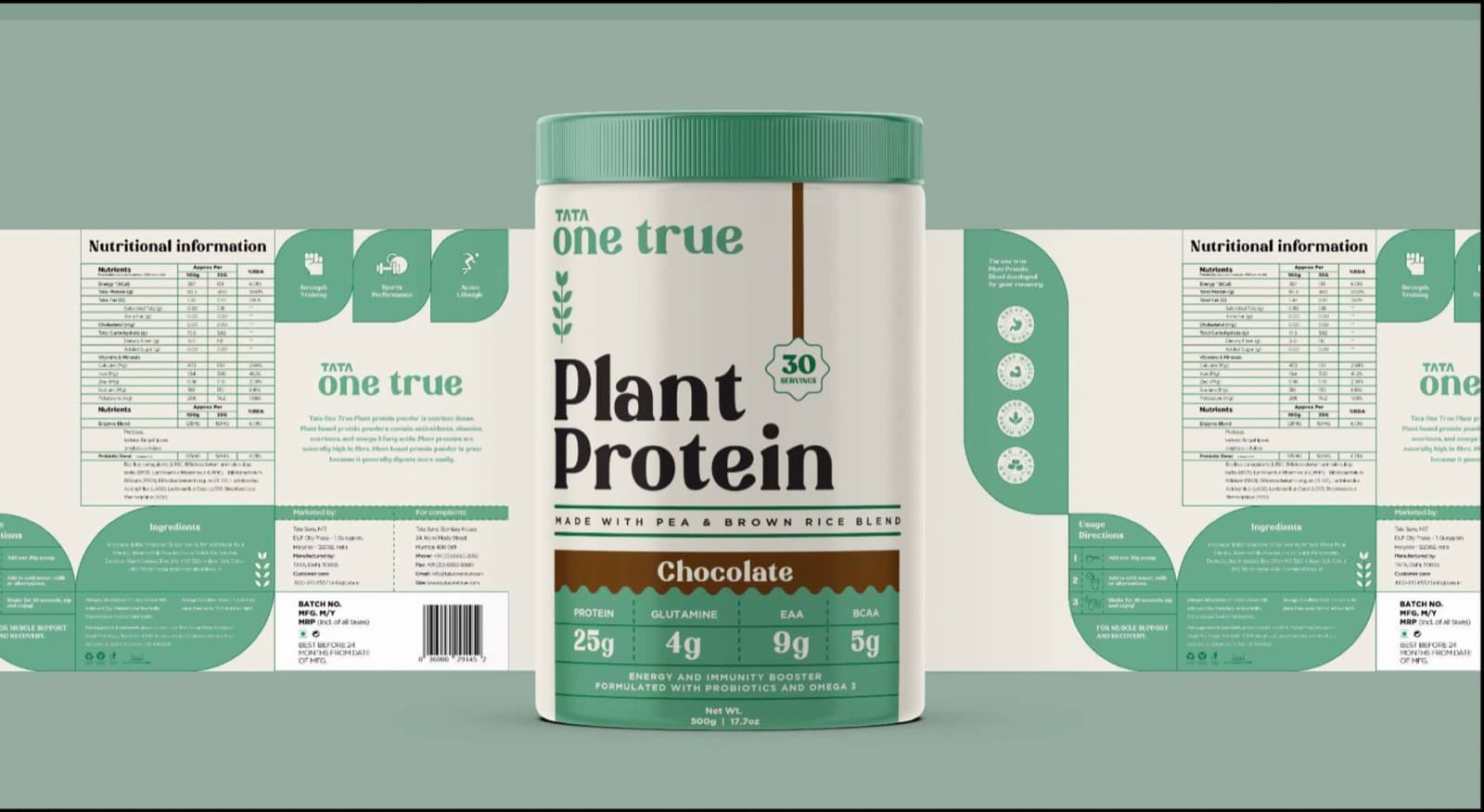
Packaging design for two plant-based protein lines, LivMo and One True, balancing Tata's heritage of trust with modern nutritional science.
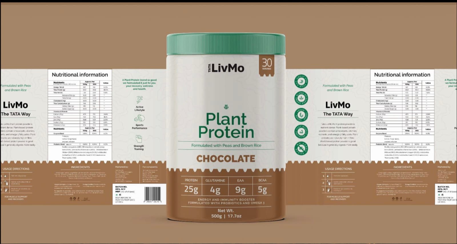
LivMo Plant Protein uses a functional yet premium aesthetic that balances Tata's heritage of trust with modern nutritional science. An earthy brown palette paired with muted greens conveys natural origin and wellness while preserving shelf visibility. The design pairs a minimalist layout and high-contrast typography with circular iconography that highlights product benefits, vegan, gluten-free, high-protein, plus lifestyle messaging around active living, sports performance, and strength training, and a structured nutritional table carrying a "Tata Way" seal for credibility.
One True Plant Protein features sage green as its dominant hue, evoking calm, trust, and nature. The design emphasizes clean minimalism to signal purity and plant-based authenticity, using rounded edges, curved graphic pathways, and a symmetrical layout. Bold, sans-serif typography carries brand recognition, while icons provide visual breathing space and a more approachable tone.
Scope
- Packaging design
Inside the TATA Consumer Goods project